Annotation
This option is passed in as the third argument for the screenshot function. It allows you to customize the highlighting of elements for a screenshot.
When to use annotation options
- You want to change the color and/or outline of the highlighted element.
- You want to add a label to help explain the screenshot:
- You want to customize where the label is placed
- You want to customize the color of the label
- You want to give the label a background
- You want to add an arrow to emphasize what is being highlighted
Annotation Object Properties
To style the highlight and label we expose a few properties on the annotation object. They're named similar to the Canvas 2D context, which is used to render the highlight and label.
Label Styling
The text that explains what is being highlighted.
-
text:- Type:
string - Description: The text to display for the label. This is the main content that will be rendered on the canvas.
- Default:
""(empty string)
- Type:
-
altText:- Type:
string - Description: Adds alt text to screenshots.
- Default:
"screenshot"
- Type:
-
fillStyle:- Type:
string - Description: The color of the label text. Accepts any valid CSS color value, including hex codes, RGB, RGBA, HSL, or HSLA.
- Default:
rgba(0, 0, 0, 1)(black)
- Type:
-
font:- Type:
string - Description: Specifies the font size, font-weight, and family for the label text. Follows the CSS font property syntax (e.g.,
"16px Arial"). - Default:
"14px Arial"
- Type:
-
strokeStyle:- Type:
string - Description: The color of the outline around the label text. Accepts any valid CSS color value.
- Default:
rgba(0, 0, 0, 0.1)(light black)
- Type:
-
lineWidth:- Type:
number - Description: The thickness of the outline around the label text.
- Default:
2
- Type:
Label Box Styling
A box that the label's text can appear it to make the text stand out more.
-
labelBoxFillStyle:- Type:
string - Description: The fill color of the label box surrounding the annotation text. Accepts any valid CSS color value, including hex codes, RGB, RGBA, HSL, or HSLA.
- Default:
rgba(0, 0, 0, 0)(transparent)
- Type:
-
labelBoxStrokeStyle:- Type:
string - Description: The border color of the label box. Similar to
labelBoxFillStyle, this property accepts any valid CSS color value. - Default:
rgba(0, 0, 0, 0)(transparent)
- Type:
-
labelBoxLineWidth:- Type:
number - Description: The width of the border for the label box. This property determines how thick the outline of the label box will be.
- Default:
2
- Type:
Highlight Box Styling
A box that is drawn around the element you wish to highlight.
-
highlightFillStyle:- Type:
string - Description: The fill color of the highlight box. Accepts any valid CSS color value. Make sure to add some transparency (
rgba(),hsla(), or 8-digit hex format like#FF000080) else it will block the element entirely. - Default:
rgba(255, 165, 0, 0.3)(orange with 30% transparency)
- Type:
-
highlightStrokeStyle:- Type:
string - Description: The border color of the highlight box. Accepts any valid CSS color value.
- Default:
rgba(255, 165, 0, 1)(solid orange)
- Type:
-
highlightLineWidth:- Type:
number - Description: The width of the border for the highlight box.
- Default:
2
- Type:
Positioning
The location of where the label is rendered.
position:- Type:
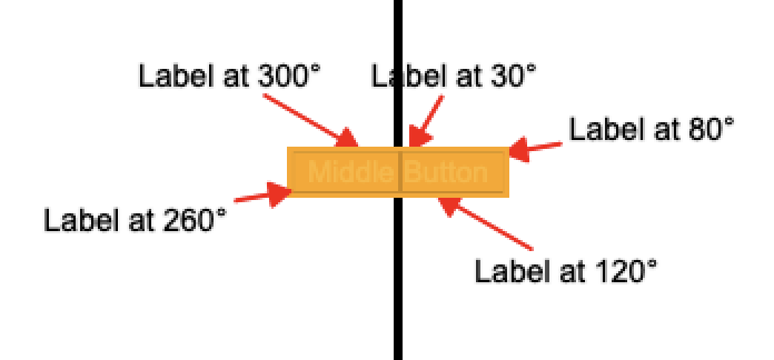
"above" | "below" | "left" | "right" | number - Description: Determines the position of the label text relative to the highlighted element. Uses clock convention where 0° = top, 90° = right, etc. If a number is provided, it positions the label at that degree angle. Defaults to automatically positioning towards the screen center.
- Default: Automatically positions label towards the center of the screen.
- Type:
Arrow
Used to point from the label to the element being highlighted.
-
showArrow:- Type:
boolean - Description: Whether to display an arrow pointing from the label to the highlighted element. When enabled, creates a visual connection between the annotation text and the target element.
- Default:
false
- Type:
-
arrowStrokeStyle:- Type:
string - Description: The color of the arrow line and arrowhead. Accepts any valid CSS color value, including hex codes, RGB, RGBA, HSL, or HSLA.
- Default:
rgba(255, 0, 0, 1)(red)
- Type:
-
arrowLineWidth:- Type:
number - Description: The thickness of the arrow line. The arrowhead size automatically scales based on this value.
- Default:
2
- Type:
Example test
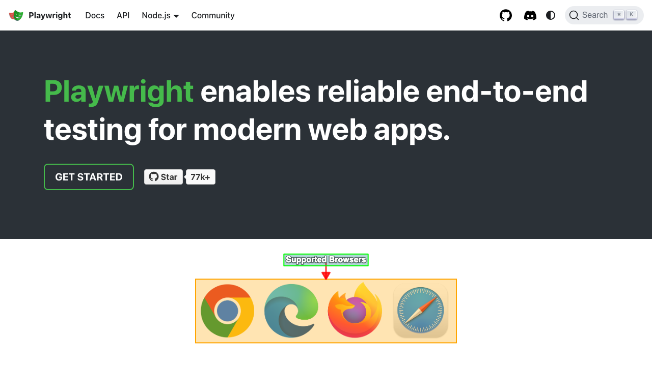
Here's a comprehensive example showing how to use multiple annotation properties together.
test.describe(withDocMeta("describe block"), async () => {
    test("test block", async ({ page }, testInfo) => {
      ...
      test.step("step block", async () => {
        await page.goto("http://localhost:5173/")
        await screenshot(
          testInfo,
          page.getByRole("img", { name: "Browsers (Chromium, Firefox, WebKit)" }),
          { annotation: {
            text: "Supported Browsers",
            fillStyle: "rgba(255, 255, 255, 1)",
            font: "bold 16px Helvetica",
            strokeStyle: "rgba(0, 0, 0, 0.5)",
            lineWidth: 4,
            labelBoxFillStyle: "rgba(0, 120, 120, 0.3)",
            labelBoxStrokeStyle: "rgba(0, 255, 0, 1)",
            labelBoxLineWidth: 2,
            highlightFillStyle: "rgba(255, 165, 0, 0.3)",
            highlightStrokeStyle: "#FFA500",
            highlightLineWidth: 2,
            position: "above",
            showArrow: true,
            arrowStrokeStyle: "rgba(255, 0, 0, 0.8)",
            arrowLineWidth: 3
          }}
        );
      })
    })
  })
Example screenshot
Example of position by number
If position is set to a number, it will render is a clockwise rotation around the highlighted element.
Configure Annotation Defaults
If you want to set default values for the annotation object you can do so in your playwright-test2doc.config.ts. Just set the annotationDefaults object in the test2doc playwright global options. These defaults will be applied to all screenshots, but can still be overridden on a per-screenshot basis.
import { defineConfig, ... } from "@playwright/test"
import "@test2doc/playwright/types"" // Add this import to add test2doc to the global options

export default defineConfig({
  ...
  use: {
    ...
    test2doc: {
      annotationDefaults: {
        fillStyle: "white",
        labelBoxFillStyle: "rgba(0, 123, 255, 0.6)",
        font: "bold 16px Helvetica, Arial, sans-serif",
        highlightStrokeStyle: "rgba(0, 123, 255, 1)",
        highlightFillStyle: "rgba(0, 0, 0, 0)",
        highlightLineWidth: 3,
        showArrow: true,
        arrowStrokeStyle: "rgba(0, 123, 255, 1)",
      },
    },
    ...
  },
  ...
})
Best Practices
- Use transparency in
highlightFillStyleto avoid obscuring elements - Keep labels concise and descriptive
- Test annotations on different screen sizes to ensure readability
- Use consistent colors across your project for better branding
Troubleshooting
- Labels not appearing: Check that
textis not empty andpositionhas sufficient space - Colors not applying: Ensure valid CSS color values (e.g., hex, rgba)
- Arrows misaligned: Verify
positionand element visibility